By designer
for designers
for designers
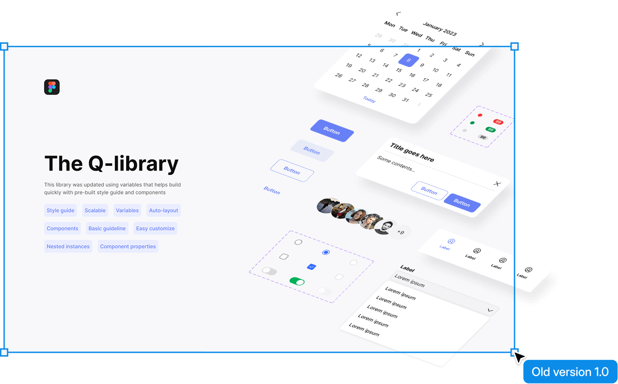
Meet 1.0 here
Including
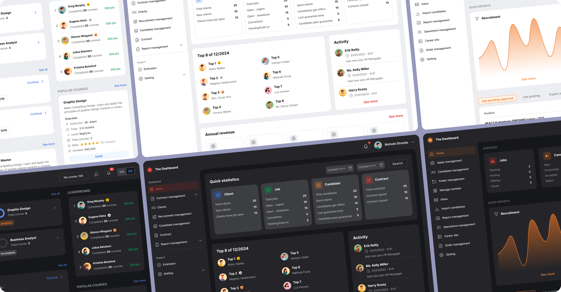
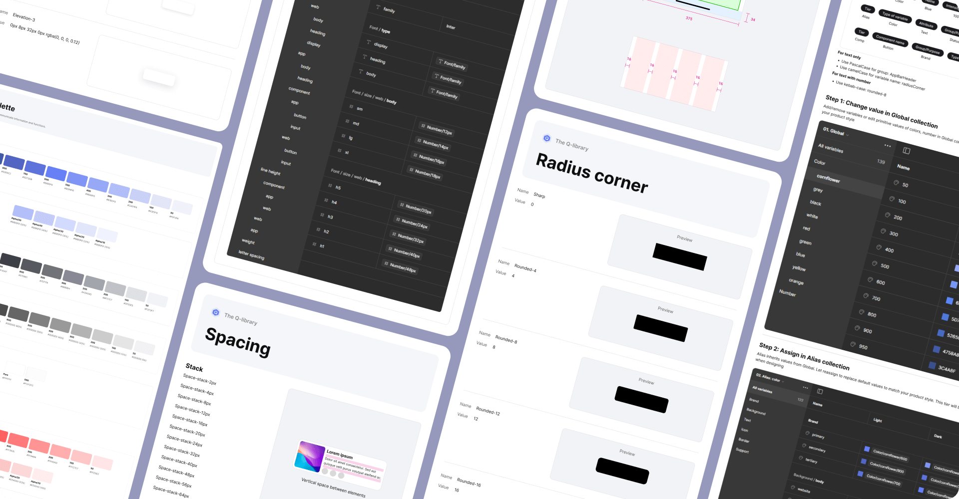
You can customize premade and basic guidelines in this library to suit the rules, definition, usage of each product.
Includings 2 versions for more options
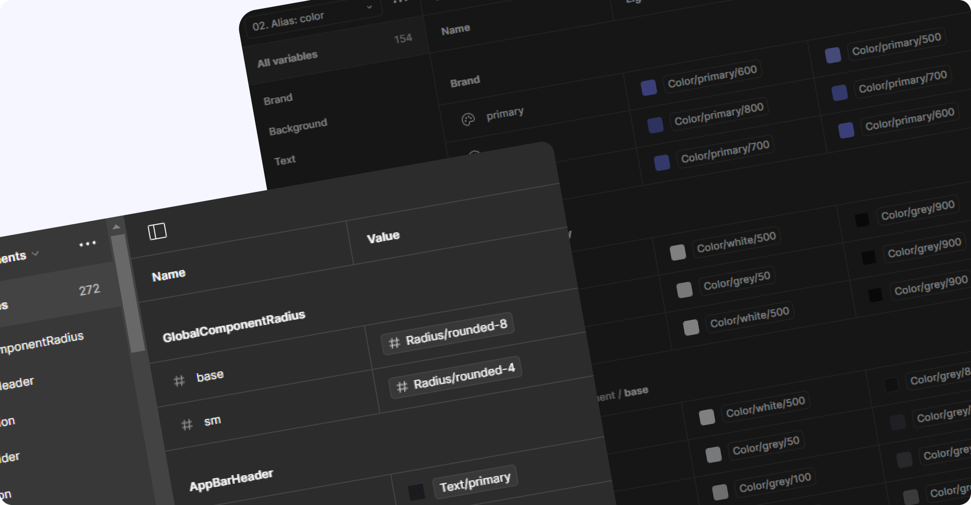
Full token tiers including Global, Alias, Component-specific tokens. Improved components and variables for use cases. Added light and dark themes. Built to prioritize convenience and extensibility.
Optimized for variables, no support for component-specific tokens. Ideal for small to mid-sized projects that need quick setup when starting. Built for prioritize convenience and quick adaptability.

So happy to get all feedbacks from you to improve this library better in the future
hs.quan214@gmail.com